Data Visualization of Tate Artists Born from 1950-1952
Midterm by Molly Bratton
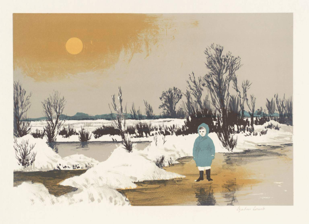
Lamb, L. (1962). Winter landscape. https://www.tate-images.com/preview.asp?image=P06322
About the Project
Sources
This project looks into the birthplaces of artists born between 1950 and 1952 who are featured at the Tate exhibition. It aims to uncover trends in the birthplaces of these artists, as well as genders of the artists. I used the dataset from Tate that provided information about the artists that have artwork in the exhibits.
Processes
I put the CSV file into OpenRefine, and performed some data cleaning in which I deleted some columns that I would not be using, and transformed the birthdates into numerical values, and added a facet so that I could narrow the date range to get a more reasonable sized dataset. I also manually went to the Tate website for each of the artists in my dataset(n = 35), and copied the link for each artist’s image, so that I could use these images in my pop-ups in ArcGIS. I then created a layer in a new GIS map with this file, and created data points for each artist, along with icons according to if the artist was male or female. Finally, I configured pop-ups with the name of each artist, along with data about them, and the photo of each artist’s artwork.
Presentation
The ArcGIS online web app is interactive, and the GIS map is formatted in a way in which each point represents an artist, and the point is located where they were born. I chose to use these symbols for each datapoint to not only make the map more visually appealing, but also to make it clear that each point represents an artist’s place of birth. The point is either red or blue in relation to female or male respectively, and the user can click on the different points to view more information about each artist, as well as a piece of their artwork.
Significance
I chose to look into this data because I really enjoy art, and I was curious if there were any patterns in the locations that artists were born. This data reveals that Europe and the United States seem to have a lot of the artists born there, and this reveals that Tate, an exhibition producer, has a majority of exhibitions from artists born in these locations. It would be very difficult to know that there were certain birthplaces that this exhibition tends to favor without this GIS map. It also reveals a clear majority of male artists in contrast with only several female artists. This project could be expanded if all of the data was used, but a method should be implemented to add the links to the artists’ images because it took a long time to get each individual artist’s image links into the CSV spreadsheet. This project relates to Digital Arts and Humanities because it allows for information about these artists to be visualized and shared, while also allowing for an interactive experience for the viewer to learn more about each artist, and dive into the culture behind the artists.
GIS Map
GIS Map of the artists featured in Tate exhibits that were born between 1950 and 1952. Created using ArcGIS.